White Space and Clean Design
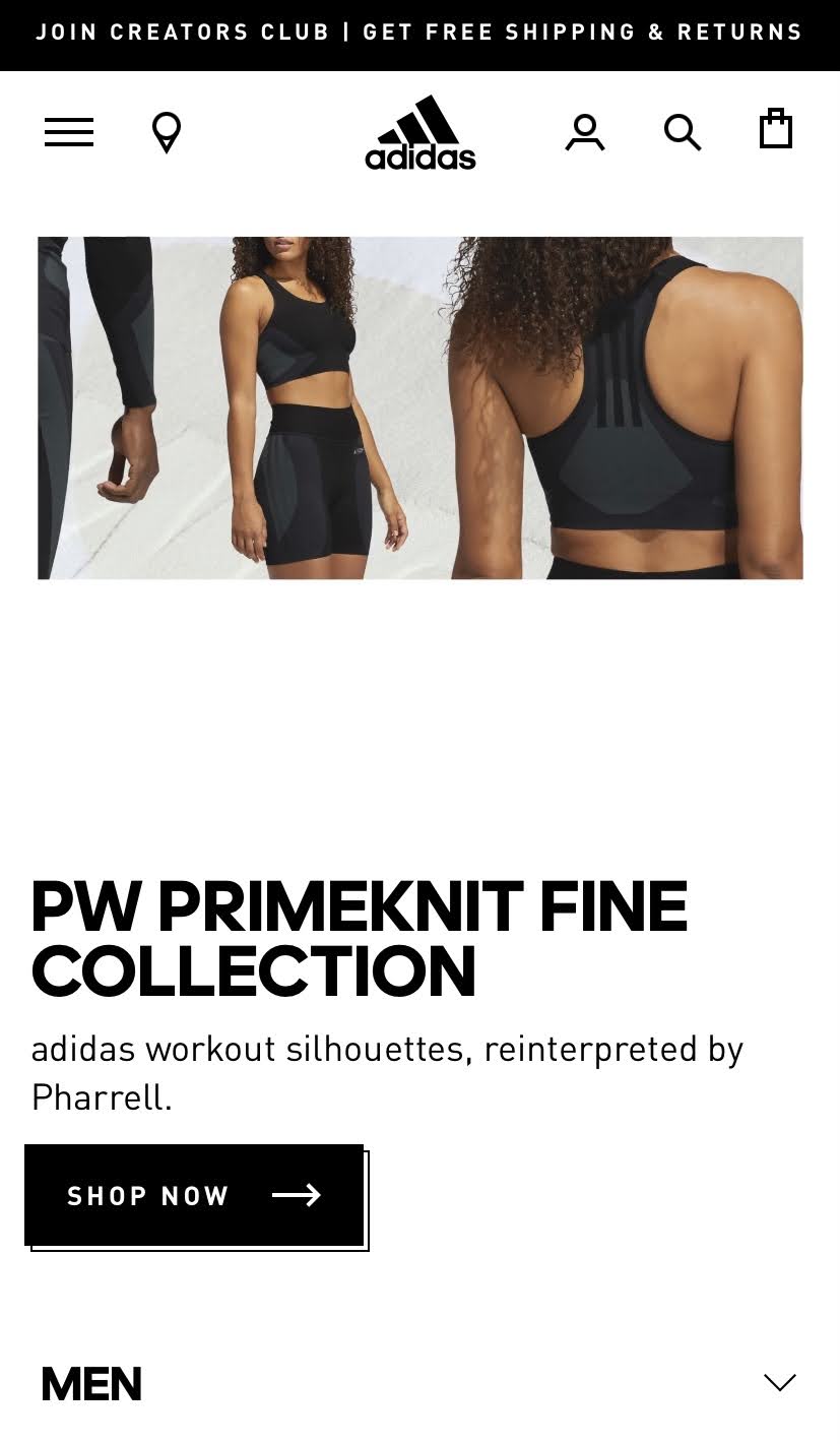
Adidas
Adidas.com
Adidas allows for plenty of whitespace between images, headers, text, and links. It allows for attention to be easily focused on the main items of the page. Although the page isnt crammed full of images and text, it still conveys the message of its brand.
Proximity
Reebock
Reebock.com
Reebock does a great job of putting related items together making it easy for the user to navigate. It makes it easy to percieve what is related and what is not. Its easy to tell that the two links below the Sale header are to access the sale on apparel for men and women. Its also easy to tell that the short paragraph is directly related to "Happy New Gear".
Visual Hierarchy
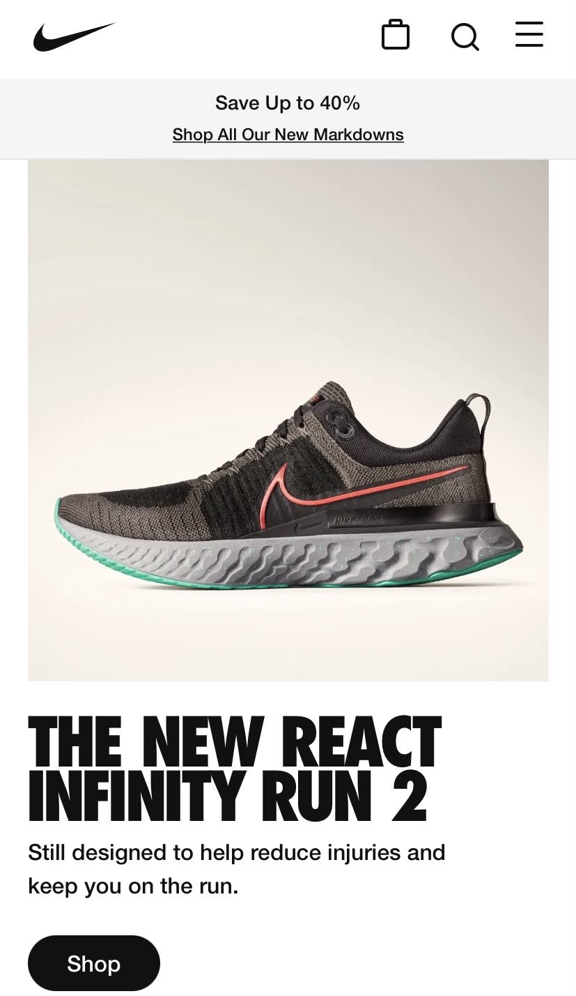
Nike
Nike.com
Nike does an awesome job of using visual hierarchy to immediately divert your attention to the large photo of the sneaker which leads you to the header below, giving the name of the shoe. Your attention is then immediately drawn to the "Shop" button. This helps users understand the importance of the shoe and that it is a new release.